

Colour. Not just decoration. Communication. Someone picks up your branded item - colours trigger responses before they even read your logo. Split-second impressions. Shapes how they feel about your brand.
Been helping Aussie businesses choose colour combinations for promotional products for 25 years. Same product in different colours? Completely different responses. Here's what actually works.
Why Colour Matters So Much
Colours affect perception way beyond aesthetics. Build brand recognition through consistency. Coca-Cola red. Telstra blue. Qantas red. Strong brands own their colours so completely that the colour itself triggers recall.
Different colours, different emotional responses. Warm colours feel energetic. Cool colours feel professional. Your choices influence how people feel about your promo items - and by extension, your brand.
Visibility matters too. Some colours demand attention. Others suggest sophistication through restraint. Right choice depends on what you're trying to achieve.
Practical stuff as well. Not all colours work equally on all products. Material, printing method, product type - all affect how colours appear in the finished item. What looks stunning on screen? Might disappoint on fabric or plastic.
Understanding What Different Colours Communicate
Blue: The Corporate Standard
Blue dominates corporate promo products. Why? Trust, reliability, professionalism. Works brilliantly for finance, technology, professional services, healthcare - anywhere credibility matters.
The catch? Everyone uses it. You're probably wearing the same colour as your competitors. Navy blue appears everywhere in corporate environments. That doesn't make it wrong - it's safe and effective. But differentiation might serve you better than fitting in. Worth thinking about.
Red: Energy and Action
Red demands attention. Energetic. Exciting. Bold. Works brilliantly for retail, food and hospitality, sports, entertainment - anywhere energy and excitement suit the brand.
Powerful though. Use for impact, but don't overwhelm. A touch of red draws attention without visual overload. Full red branding? Suits bold brands comfortable making statements.
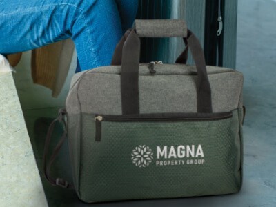
Green: Nature and Growth
Green. Nature, environment, health, growth. Increasingly popular as sustainability becomes more important. Environmental businesses, health and wellness, outdoor industries, even finance companies (prosperity associations) use it effectively.
Green's become almost synonymous with environmental responsibility. Sustainability part of your brand message? Green helps communicate that instantly. Just make sure your green claims are genuine - consumers are savvy about greenwashing now.
Yellow: Optimism and Visibility
Yellow. Optimism, happiness, energy. Attention-grabbing for creative industries, youth markets, safety applications where high visibility matters.
Practical challenge though - text in yellow often becomes hard to read, especially on white backgrounds. Use for impact, not detailed messaging. Pair with darker colours when legibility matters.
Orange: Friendly Energy
Orange. Energy of red plus friendliness of yellow. Approachable, enthusiastic, good value feel. Food and beverage, youth markets, retail, creative services - all use it effectively.
Interesting middle ground. Less corporate than blue, more serious than yellow. Brands wanting energetic without aggressive? Orange often strikes the right balance.
Purple: Premium and Creative
Purple. Luxury, creativity, sophistication. Suits premium brands, creative industries, beauty and cosmetics - businesses wanting to stand out from the sea of blue.
Relatively rare in promotional products. That's the opportunity. While competitors blend into blue and red, purple-branded items get noticed. Differentiation.
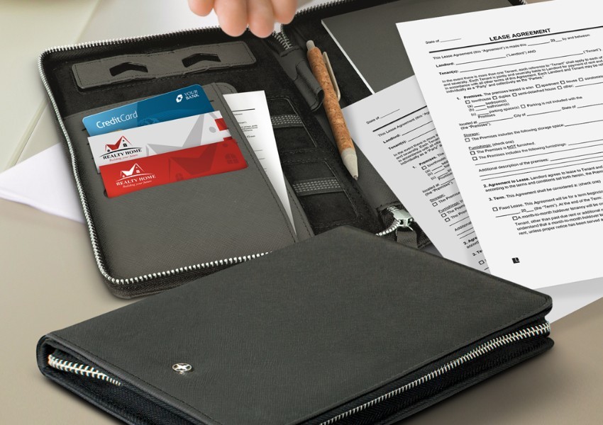
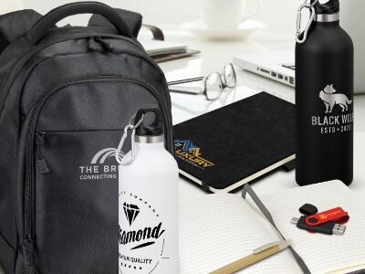
Black: Timeless Sophistication
Black. Never goes out of style. Sophistication, elegance, premium positioning. Luxury brands, technology, fashion - all use it effectively.
Works on virtually every product type. Photographs exceptionally well. Safe choice that rarely disappoints (though lacks the energy of brighter alternatives).
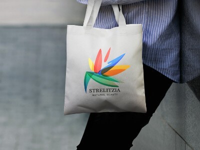
White: Clean Simplicity
White. Simplicity, cleanliness, modernity. Healthcare, technology, minimalist brands. Modern design trends have made white increasingly popular.
Practical consideration though - white shows marks and dirt more readily. Distribution context matters. Will these items stay pristine?
Practical Colour Considerations
Beyond psychology, practical factors shape what's actually achievable.
**Printing methods.** Screen printing works best with solid colours, limited colour counts. Full-colour printing handles complex combinations but may not exactly match brand specs. Embroidery uses thread colours that approximate your palette (won't be exact). Engraving creates single-colour or contrast effects only.
**Materials.** Plastics offer wide colour ranges but may fade with UV exposure. Metals limit you to coatings or engraving contrast. Fabrics show dye-lot variations. Ceramics reproduce colour excellently with appropriate decoration.
**Colour matching.** Pantone (PMS) codes ensure consistency across different items. CMYK approximates but may not match perfectly. Different materials produce different results even with same specifications. Request samples if exact matching matters.
Building Your Colour Strategy
Thoughtful planning improves effectiveness considerably. Start with brand consistency - use established colours across promotional products to build recognition. Random choices dilute brand impact and confuse customers.
Most brands have primary and accent colours. Primary appears consistently on everything - creates instant recognition. Accent provides variety while maintaining connection - useful for specific campaigns or product lines.
Contrast for legibility. Dark text on light backgrounds (or vice versa). Sufficient contrast for small text and logos. Consider colour blindness accessibility - significant portion of your audience may perceive colours differently.
Match colours to context. Office items? Professional blues, blacks, greys. Sports items? Energetic reds, oranges, bright greens. Environmental products? Natural greens and earth tones. Premium corporate gifts? Sophisticated blacks, deep blues, burgundy.
Colour Trends and Classic Choices
Colour preferences shift over time. Some choices stay consistently popular.
**Current trends:** Earth tones (sustainability focus). Pastels for certain markets. Neons for attention (use carefully). Metallics for premium feel. Natural colours matching eco-friendly materials.
**Classics that never date:** Navy blue - professional without being boring. Black - timeless sophistication. White - clean versatility. Red - attention that always works.
**Industry palettes:** Finance goes for blues, greens, conservative choices. Technology embraces blacks, metallics. Healthcare relies on whites, blues, greens. Food uses reds, oranges (appetite-stimulating). Creative industries? Bold, distinctive choices.
Common Colour Mistakes to Avoid
We see these regularly. Avoidable stuff-ups.
**Ignoring brand guidelines.** Random colours when established brand colours exist. Dilutes recognition, wastes the investment you've made in consistency.
**Poor contrast.** Text and logos need sufficient contrast to be legible. Light on light, dark on dark - branding becomes invisible. Pointless.
**Too many colours.** Increases complexity and cost while reducing impact. Simple schemes often create stronger impressions than complex ones trying to include everything.
**Ignoring product limitations.** Some colours don't work on certain products or printing methods. Discuss before finalising rather than discovering problems during production.
**Chasing trends.** Can date your items quickly. Classic choices remain relevant longer. Balance current appeal with lasting effectiveness.
Working with Us
Colour decisions. Heaps of variables affecting the final result. Experience helps.
**Tell us your brand colours and products.** We'll advise on what works. **Samples for critical matching.** Verify appearance before production. **Explain outcomes.** Different printing methods and materials produce different results - we'll help you understand what's achievable.
Give us a call on 1300 85 50 35 or contact us online. Tell us what you're trying to achieve. We'll point you toward colours that actually communicate what you want. Done.
Frequently Asked Questions
How do I choose colours for promotional products?
Start with your brand colours for consistency. Make sure there's enough contrast to read your logo. If you're unsure, navy, black and white are safe choices that work on most products.
Can you match my exact brand colour?
Send us your Pantone code and we'll get as close as possible. Different materials produce slightly different results, but we'll advise on what's achievable before you order.
Do colours affect how people see my brand?
Yes. Blue feels trustworthy. Red feels energetic. Green feels natural. Your colour choices influence how people feel about the item and your brand. Worth thinking about.
Should I always use my brand colours?
Usually yes, for consistency. But there are exceptions. Event-specific colours, seasonal themes, cause-related campaigns. Talk to us about what you're trying to achieve.
What's the minimum order?
$500 per invoice. Give us a call on 1300 85 50 35 and we'll work out what that gets you for whichever products you're looking at.